Think It Ink It Publishing

For children seeking to express themselves in an enjoyable way—and for parents who enjoy it when learning is fun—comes Think It Ink It Publishing. Think It Ink It Publishing produces write-your-own storybooks that are transformed via the Internet into a young author’s very own hard cover, professionally illustrated book.
Asked to help launch these storybooks we developed a series of custom books, workbooks and logo which won national media attention. Because much of this business is done online, we organized an intuitive, easy-to-use website to sell their products.
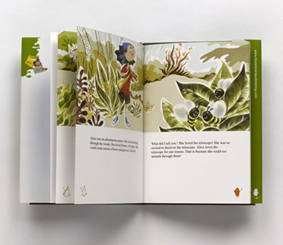
The custom hard cover books include professional illustrations, which provide a topic and the initial ideas for young writers to use as a starting point to help them express their “inner author”. The books were designed with illustrations that are filled with rich details to capture the reader’s imagination and enhance their visual literacy.
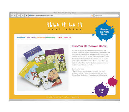
The website’s easy-to-use interface allows users to write their custom books online, purchase workbooks or gift certificates and provides educational benefits, such as writing tips and vocabulary. The design is bright and playful.
Slade & Associates, P.C.
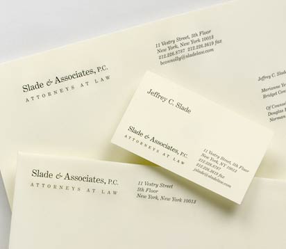
Located in midtown Manhattan, the law firms plan was to move to Tribecca in order to step away from the familiar industry iconography. The opportunity was to create a new identity maintaining the talents of attorneys—aggressive advocates of client rights in both civil and criminal matters—with the more relaxed environment. The new logotype focuses on a sophisticated modern approach. The logotype was followed by a redesign of the stationery system.
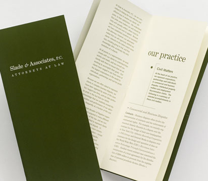
The effort continued with the design of a corporate brochure. The brochure focused on client achievements to describe the firms capabilities. A slim size was developed to fit the brochure into a letter-sized envelope and included an interior pocket to hold the expanding attorney biographies.
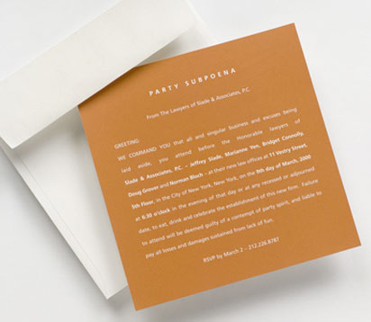
Slade & Associates draws clients that desire more partner-level attention than they might receive elsewhere. In keeping with these relationships, and with a bit of humor, we developed the “party subpoena” which invited clients to visit the new location and office space.
Arts Counsel
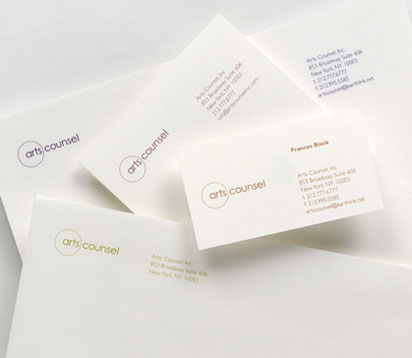
Arts Counsel is a creative development specialist firm; exclusively representing and managing the careers of 24 illustrators; whose projects involve many markets, including publishing, advertising, retail, and merchandise.
Asked to redesign their identity we began with their logotype. Drawing upon a circle’s positive symbolism—having no beginning or end, no divisions and making it the perfect symbol of completeness—we enclosed the word “arts” to underscore the company’s main platform. The logotype was incorporated into all communications, each using a different color, ultimately creating a spectrum when presented together.
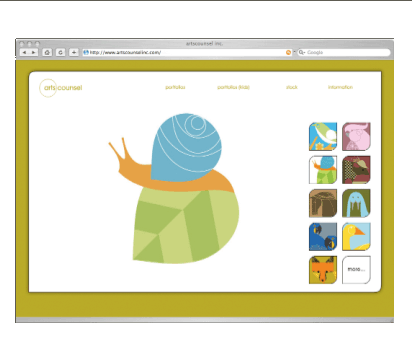
Conceived as an online portfolio, the newly designed website enables prospective clients to select and view one of Arts Counsel’s 24 artists. The site was designed to show each eye catching illustration at a large scale, which could load quickly, ultimately showing details clearly.
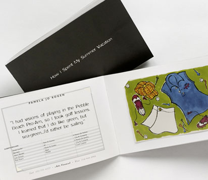
To set Arts Counsel apart with a differentiating look and feel, tone of voice and message, we suggested creating an annual large-scale promotion piece.
“How I Spent My Summer Vacation,” told playful stories about each of their illustrator’s summer experiences. The book was printed in black and white, while the artwork was printed as a postcard and inserted into dye cut pages of the book.
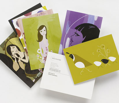
Recognizing that Arts Counsel would need additional tools to communicate on a regular basis, to prospective clients, we suggested developing a direct mail program. The program materials, consisting of a series of monthly promotional postcards, are sent to targeted business segments. The success of the postcards was widely recognized by executive management as projects were initiated directly after mailings were received.
Eye Institute of New York
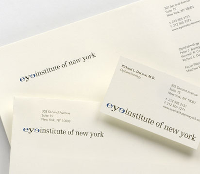
Dedicated to providing professional care for the eyes, Eye Institute of New York delivers top-quality services from comprehensive eye exams to delicate surgery.
We were approached by the two founding ophthamologists to create a compelling visual identity. We designed a dynamic charismatic logotype—juxtaposing the “e’s” to appear as eyes on a face—effectively promoting the nature of their services.
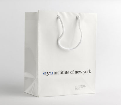
A shopping bag was developed as a comprehensive coordinated package to accommodate surgical eye kits, glasses and other product lines.
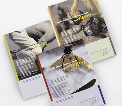
Extending the companys brand, we developed a series of ads, which appeared in Travel Sport magazine. The underlying theme was to promote LASIK surgery to the “weekend warriors” as well as introduce Eye Institute of New York’s state-of-the-art vision care services to this younger active demographic.
Stevens Institute of Technology
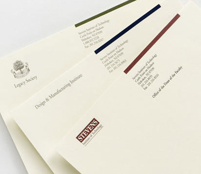
Stevens’ five-year vision was to be recognized as a premier technological university noted for its distinctive educational and research programs. But the schools positive attributes—it’s research centers—were not clearly integrated within the schools system. Our mission was to support the overall goal and to bridge these boundaries.
Our first step was to replace the schools inconsistently used logo, colors and multitude of mismatched stationery. We modified the Steven’s logo choosing burgundy, the color originally associated with the school. Our next step focused on the research centers. We updated their logos, and in some cases created new ones. Lastly we established a secondary palette for the centers.
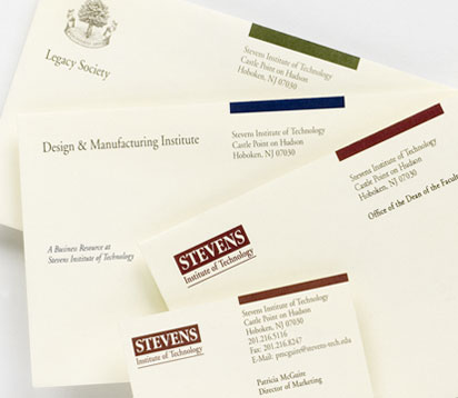
The logos and color palettes were followed by the design of stationery system. Developing Stevens, as the umbrella program, the research centers followed this newly created format. The tagline, “A Business Resource at Stevens Institute of Technology” was developed and placed on all the centers materials. The tagline, along with a cohesive identity program, successfully linked the research centers back to the school.
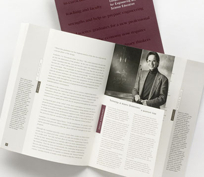
The re-branding continued with the development of Competitive Strategies for Engineering and Science Education a marketing communication meant to integrate the schools departments and its business resources. The first installment featured prominent images and overviews of selected faculty research projects on short cut pages, while the provost/academic dean discussed engineering principles that leverage the schools strengths as the continuing text.
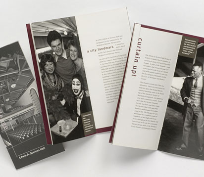
Additional promotional materials, like this fund raising brochure, were created in keeping with the re-branding. The burgundy and gray color palette, the use of large scale photography and a clean format enhance the sophisticated updated look.
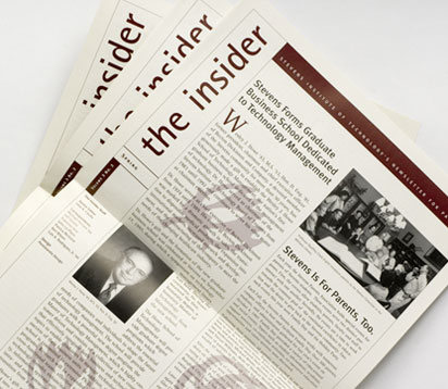
The Insider, a quarterly newsletter for parents, was developed to deepen the schools goal of promoting continued excellence in education. The newsletter keeps Stevens parents appraised of curriculum, faculty activities, engineering advancements and encourages participation in parent-student related events.
Harvest Gourmet Caterers
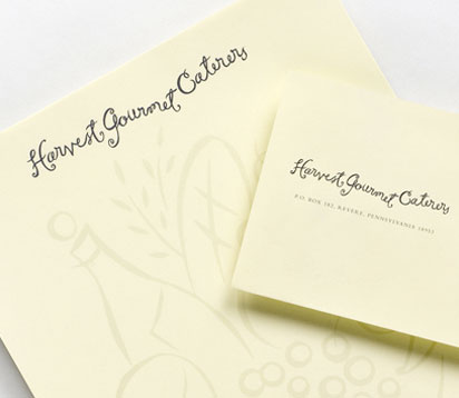
Inspired by the growing “Locavore” trend, Harvest Gourmet Caterers uses local foods as they come into season to prepare many of its meals. Eating local, sustainably grown products inspired us to create an identity system that harkened back to the earth. Handwriting and simple illustrations portraying a bounty of foods became the essence behind the design program.
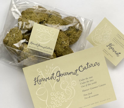
Homemade cookies, sandwiches and other delicacies were packaged in clear bags, with a simple label placed on top. A large scale note card promoted the company with a simple poem, while the back side provided space for correspondence.
The Richmond Organization
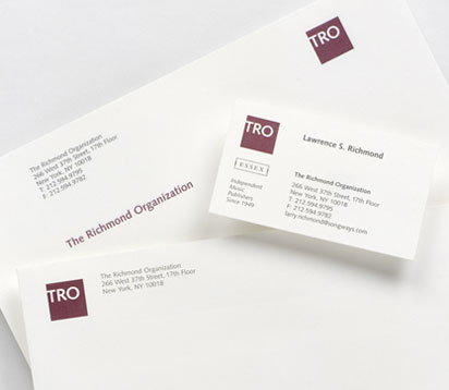
The Richmond Organization, an independent music publisher wanted to update its identity after 50 plus years in the business.
After extensive research we found the company was well know in the business by its acronym, TRO, rather than their full name. We suggested incorporating this shortened version as part of the new identity. A simple red square, which holds the three white letters, became the solution to updating their image. The logo has been applied to marketing and collateral materials as well golf tees, pins, hats and other promotional give-aways.